SAVING FOOD. CHANGING LIVES
The Brief
After unprecedented early growth, The Felix Project came to us with a problem. Over their first two years, whilst they had experienced some amazing success, their brand had fallen by the wayside, suffering with multiple inconsistencies as well as an undefined tone of voice. Excitingly, they had also become the chosen charity for the Evening Standard Christmas campaign. This meant potentially huge exposure, but it also meant their brand image and website had to be good enough to take centre stage, and they needed to accomplish all of this fast (within just seven weeks).
Our Response
The Felix Project was named after the founder’s son, Felix, who died suddenly from Meningitis in 2014, and was inspired by Felix’s compassion for the boys on a rival team at a football tournament, after he found out that they were playing on empty stomachs.
Our competitor analysis, focussing primarily on brand logos and colours, revealed that not many charities had a name that was so personal and integral to the origins of the charity. This gave The Felix Project some crucial brand identity distinction.
Founded as recently as 2016, The Felix Project is a UK-based charity combatting the dual social issues of food waste and food poverty across London.
Their existing strap of ‘good food for good causes’, was ambiguous and did not really convey the charity’s reason for being. Our research also revealed that the term surplus v’s waste isn’t typically understood. The Felix Project reduces the annual waste of 540,000 tonnes of edible food, but also help feed the 100,000 Londoners living in food poverty. Breaking it down further, our wordsmiths came up with; ‘Saving Food. Changing Lives’. Just four words, but four words that really amplify the essence of what The Felix Project do.
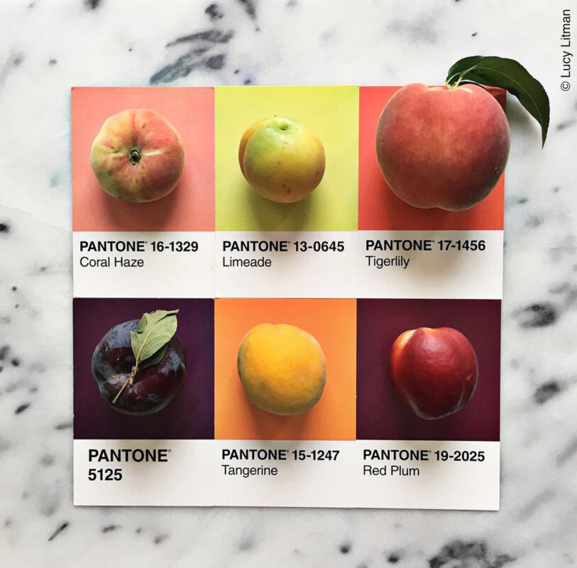
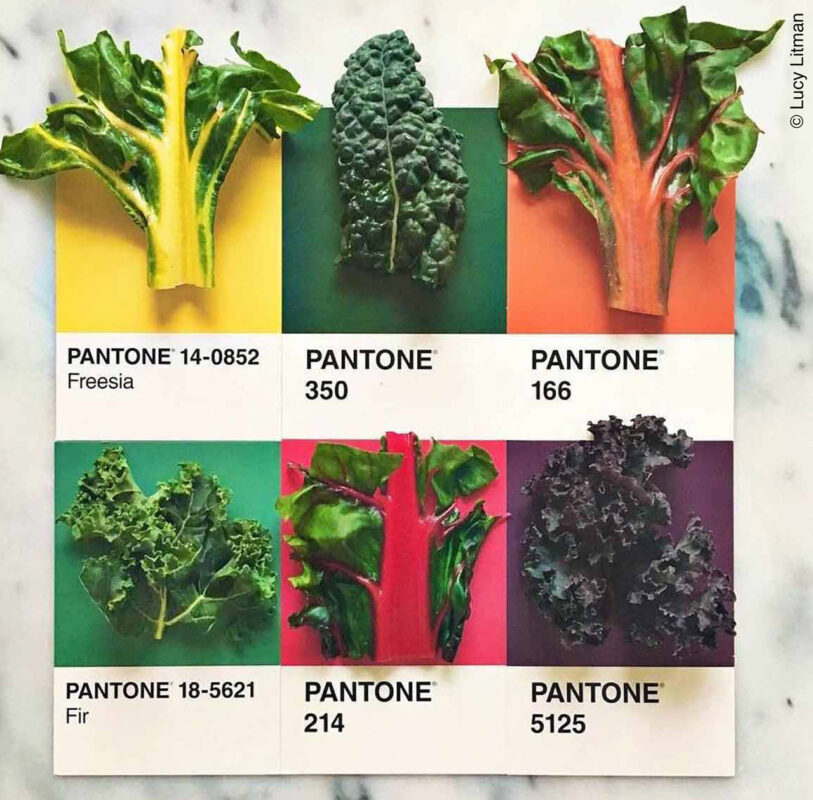
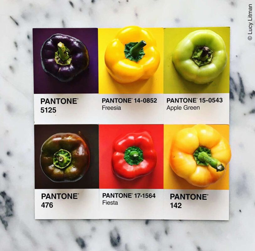
Their existing primary colour palette did not distinguish them from their competitors, nor truly reflect the brand. We researched a whole range of colours, through peach to kale, and eventually settled on cherry, plum and orange for an expanded secondary palette. This gave a striking visual identity that embodied the vibrancy and freshness of the food that’s integral to their work, setting them apart as a brand, and giving real depth and spread to the colour palette.
The brand’s original tone of voice was quite flat, factual, and lacked a little emotion. Furthermore, the existing brand language (on the website especially), had a lot of surplus text. Efficient, concise use of language was made intrinsic to the brand’s personality, for if their reason for being was to tackle food wastage, then their brand language really had to be in the same vein. Their brand’s new voice was also intelligent yet conversational, welcoming yet direct, sympathetic but not pleading.
“I volunteer as a co-driver at least twice a week and feel so privileged and so happy to work with the best team of people from many different backgrounds, nationalities and professions. This is a most fulfilling and heart-warming new chapter in my life.” John McNally, Volunteer
The Results
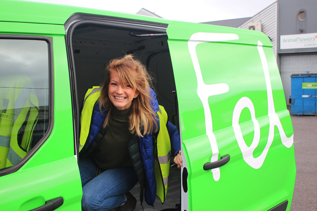
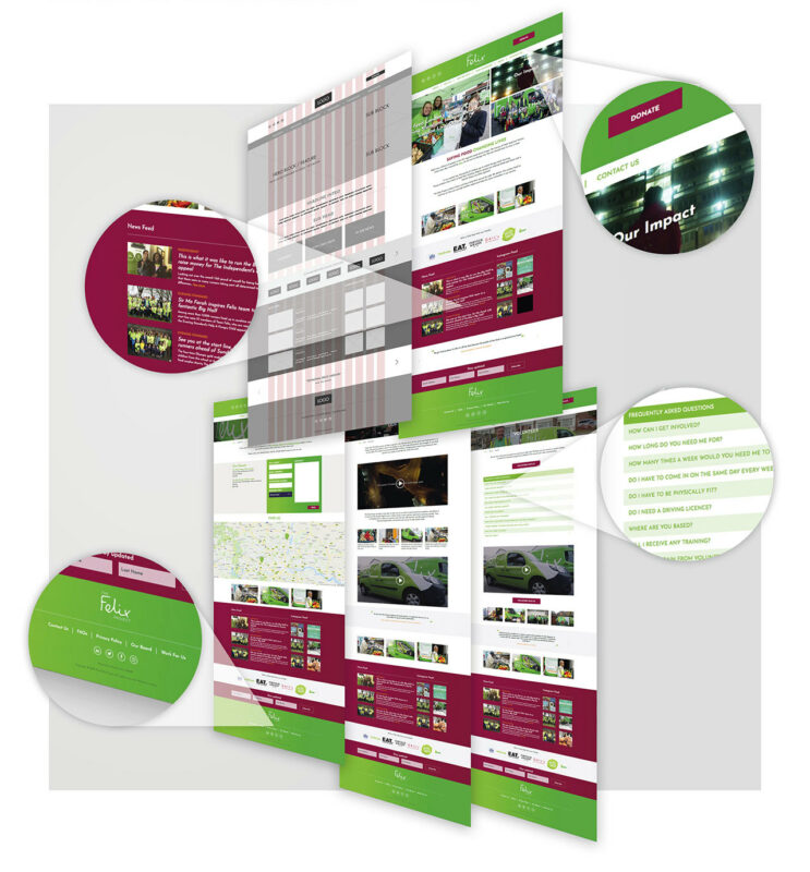
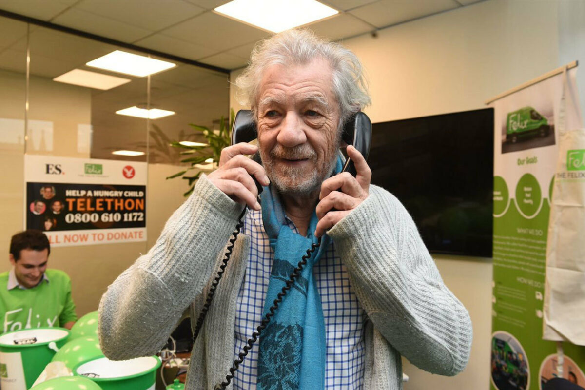
Since the new branding was unveiled, The Felix Project has achieved some great coverage in national publications like The Independent. The brand identity has agility for use in a whole multitude of scenarios; from the sides of the vans darting around London, to the email signatures of the employees. It was robust and striking enough to give them the confidence to go above the line, as we also helped them with advertising concepts. More coverage means more click through, and the new website is a great place for inquisitive people’s journey to land, learning more about the charity, and ultimately donating.
"We love the Felix Project. Without the fresh produce, it would limit the service we could offer our guests quite significantly." Kizzy Anderson, Refuge Support Worker, Housing For Women.

“We love the Felix Project. Without the fresh produce, it would limit the service we could offer our guests quite significantly.”
Kizzy Anderson, Refuge Support Worker, Housing For Women.

