School rebranding
The Brief
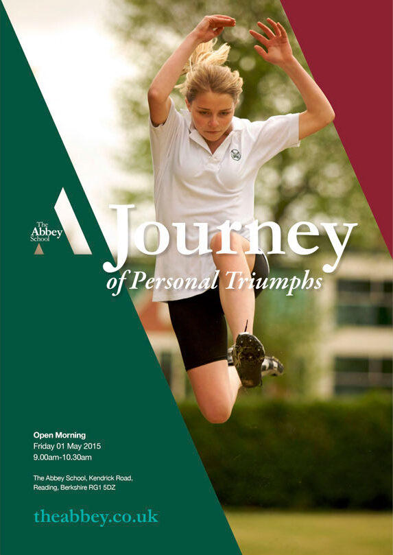
The School wanted an evolution of their branding to reflect the start of a new era and freshen up the look of materials that hadn’t seen a style change for over 6 years. There was a definitive list of deliverables, including brand identity, advert templates, email framework, newsletter and screen templates.
A crucial part of all this was a simple branding device that could be used where the complicated school crest didn’t work.
Additionally, a powerful strapline for advertising was needed. It would be integral to communicating that, whilst academic attainment is highly important, the Abbey School offers so much more than that.
The Response
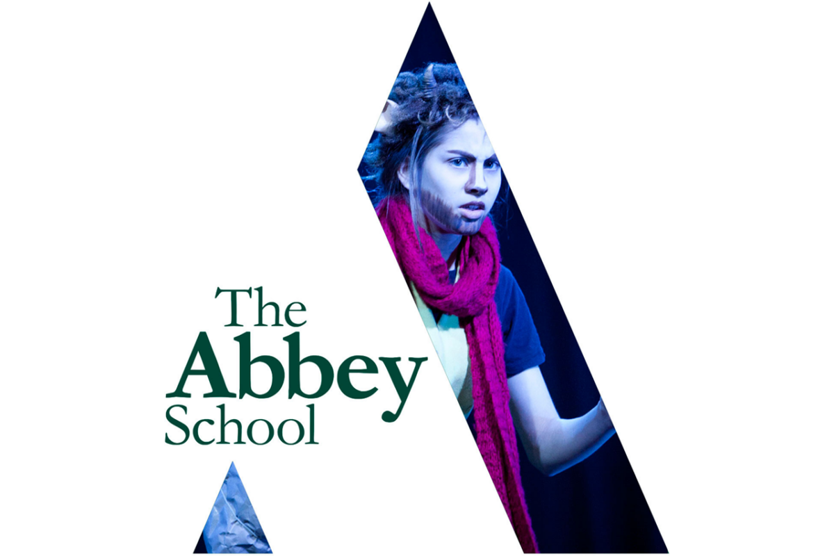
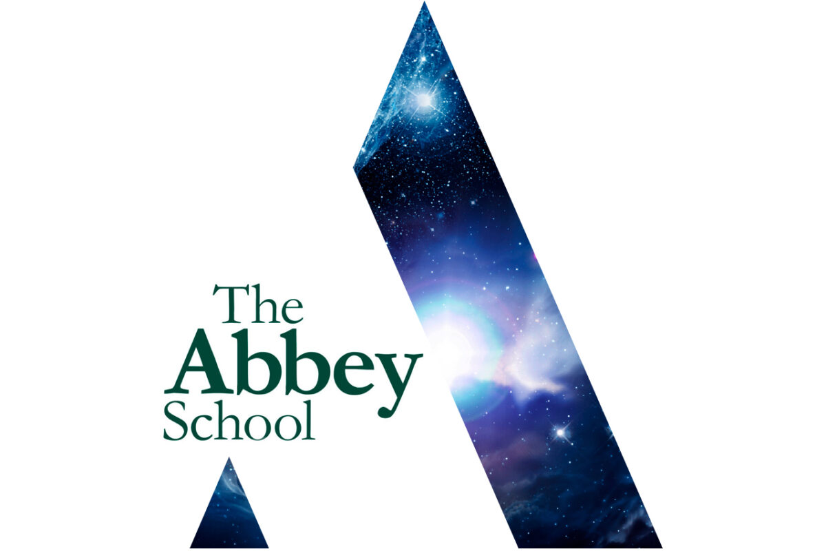
We started by creating the branding device. A capital ‘A’ was stylised to evoke a pinnacle; the essence of a girl’s journey at the School. We retained green as the primary colour of the palette, as it gave them a unique distinction in the Reading area, however, the School can appear a little austere to those on the outside. With this in mind, we gave the device a thoughtful touch by allowing it to become a living logo. This flexibility enabled any underlying photographic image of the school and its pupils to become visible, giving the device an authentic way to communicate a key message of the School; what it is like ‘inside the gates’. The School is certainly softer and more fun within.
We thought long and hard on the strap. We knew we wanted to get away from all the usual, predictable school rhetoric of ‘Excellence’, ‘Achievement’ and ‘Academic’. The final strap was in the end just naturally born out of the branding device: ‘A Journey...’ The overall theme of a journey, whilst unique, has flexibility that still allows the School to talk about the important elements of education, such as “a journey of discovery”, when their communications needed to.
The tone of voice is confident, conveying the School as leaders in education, yet it has a positive, relaxed cadence that evokes feelings of approachability and warmth. The use of ‘always’ supports the deeper message of the genuine and long lasting affection that students have for the school, which continues once they leave.
The Results
With a school rebranding, there are a lot of different people to please, not least the girls themselves! The crest has been retained to endorse heritage in uses such as letterhead and exercise books, whilst the new graphic is used for impact branding.
The response was so positive in fact, that after viewing the first round proofs of artwork, the School asked us to handle the creating of a completely new website, for which the new branding was integral.
The key desirable we took from the subsequent briefing sessions was to create a distinct stand out from the Abbey’s competitors, so we immediately conducted comprehensive research of all their competitors, both locally and further afield.
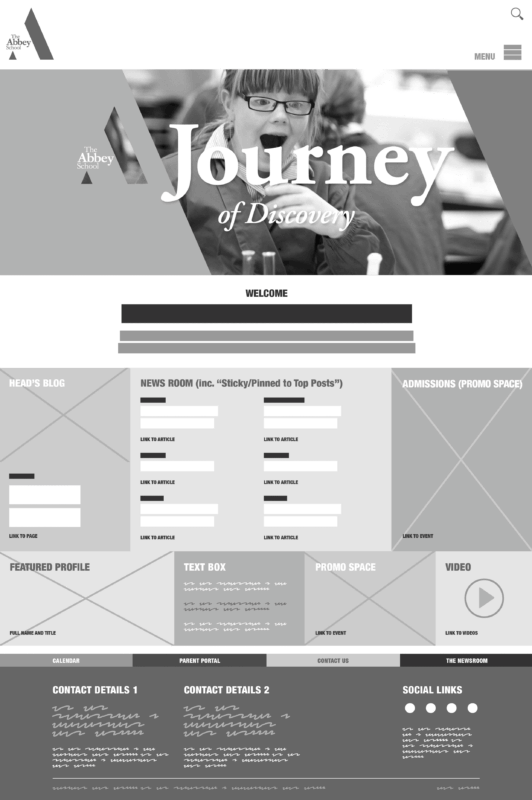
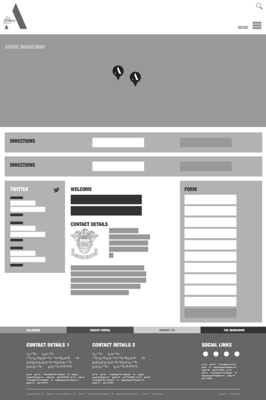
We wanted to retain the huge equity of the living logo and journey theme, and these manifested themselves in the form of a central news hub for the website. We also ensured the new site was fully responsive for mobile, as crucially over half of site visits were made via mobile devices. The Abbey School asked us to ‘treat every page as if it were a landing page’, so our hub was a forever changing, living thing with fresh, current content. It became the focal point for navigation of the site, and the CMS we employed amply supported this function, whilst the site also had sufficient functionality to meet the demands of online events booking and an admissions system.
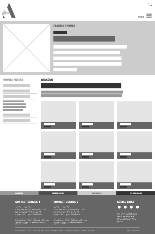
The news hub gave precedence to the Head’s blog and a regularly changing featured profile, which could put the spotlight on potentially anyone with a connection to the Abbey School; current students, alumnae, staff, yet also parents. The website thus has easy accessibility, allowing users to dip in and out of a large Abbey community they could very much feel a part of.

Sue Gutierrez, Director of Marketing, The Abbey School
“The rebranding project, including a new website & prospectus, created a strong stand-out look that captured the essence of the School. Gasp are friendly, fun and enthusiastic, whilst being utterly professional - a very special formula.”


