Not social listening. Social understanding.
…Gasp! was delighted to be recommended to D/A to deliver stand out creative and storytelling to cut through the noise in a crowded and primarily tech-focussed market.
The Brief
Find and recommend an opportunity for distinction in a tech-focussed category. Heavily digital focussed in its marketing culture, the UAE presents a tough market for emotional story-telling to find a place. But in this we saw a huge opportunity and so when our research told us this was the white space to work with, we jumped straight in with a cutting-edge narrative to stand out from the crowd.
D/A makes marketing in the Arabic-speaking world more effective by giving businesses a better understanding of their audience. Their AI consumer intelligence platform, Sila, operates natively in Arabic so there is no dilution of vocabulary or sentiment through translation, giving consumers the highest possible accuracy of Arabic insight. It’s purpose built tech that is unrivalled and proven.
The Response
It all started with some proper diagnosis and research…
We researched a set of 8 major competitors, taking record and measures of brand assets/codes including logos, slogans, sonic/sounds, colours, tone, word frequency and more. Now we had a baseline, a set of weights and measures for what was expected. It also threw into sharp relief the gaps and white space for what was unexpected.
We found that tone of voice was lacking across the competitor set in favour of industry buzzwords and technical descriptions which can be confusing for the reader and create barriers to understanding. Benefit-driven, emotional story-telling was absent, creating huge opportunity for D/A to build relationships and connect on a deeper level.
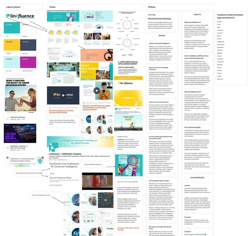
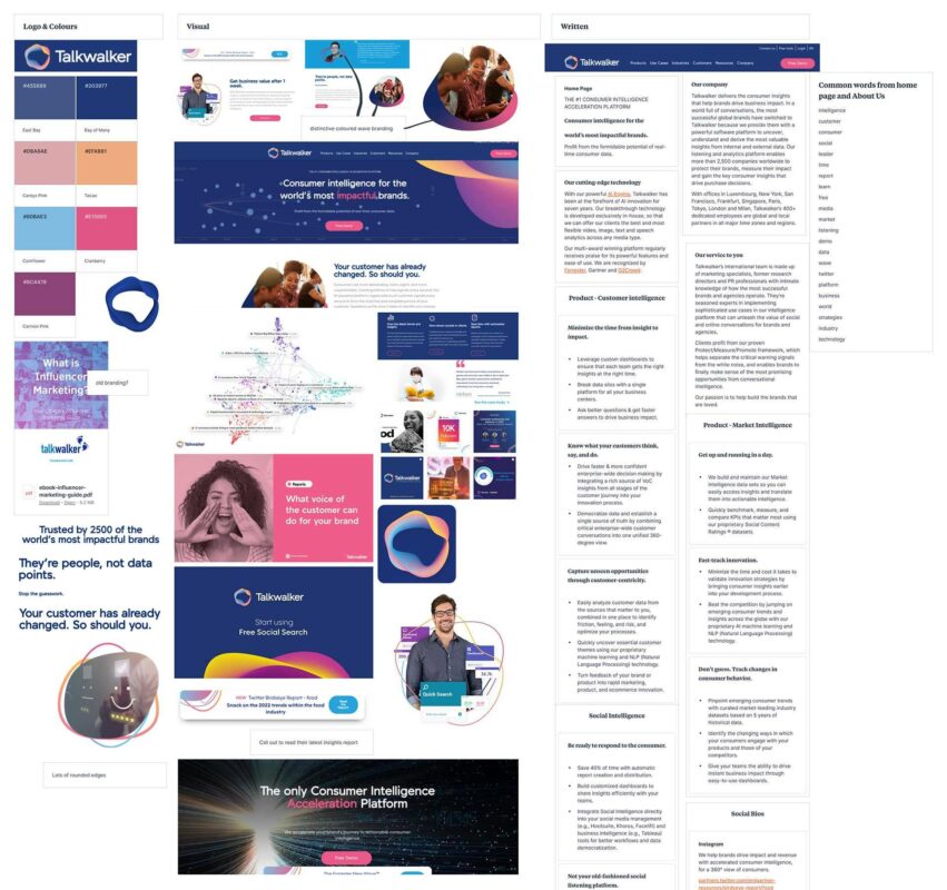
We validated this desk research with some intense interviews with D/A stakeholders and set about getting the verbal positioning nailed. Focussing on benefits and stripping away the technical jargon, D/A loved the simple, translatable tone of voice that cut through the waffle and didn’t leave customers baffled by their offering (a common problem in the past).
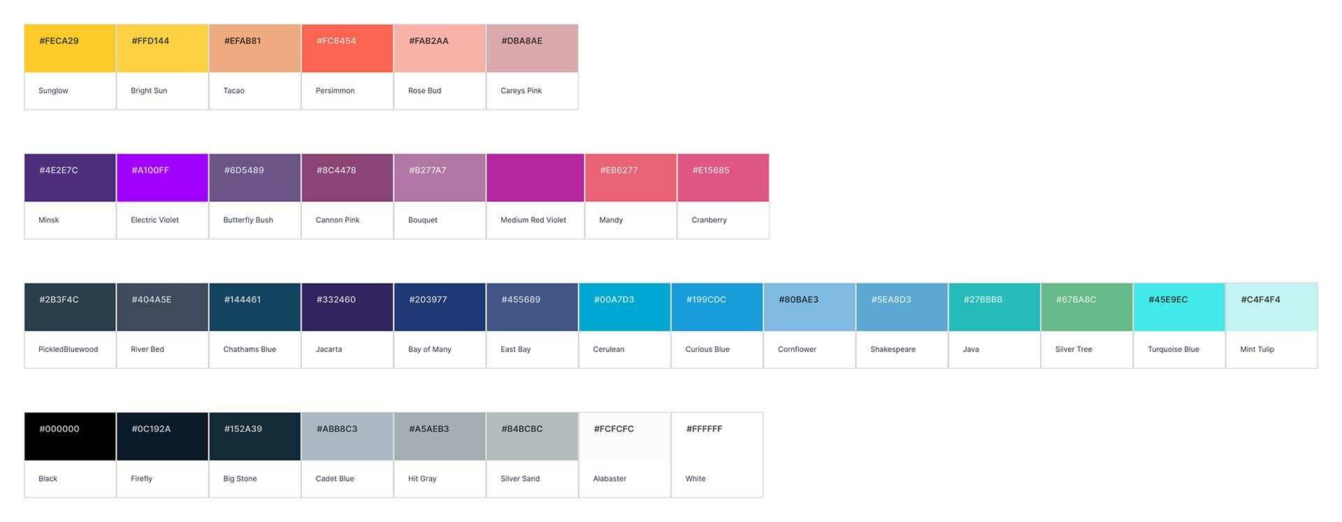
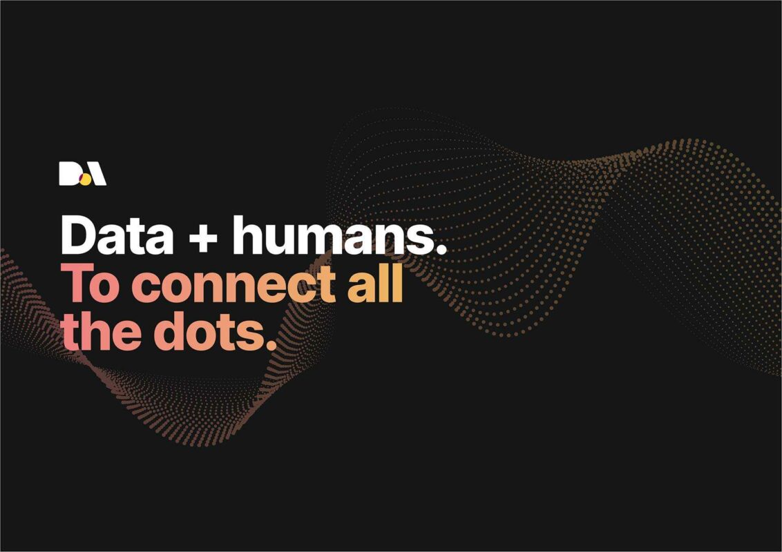
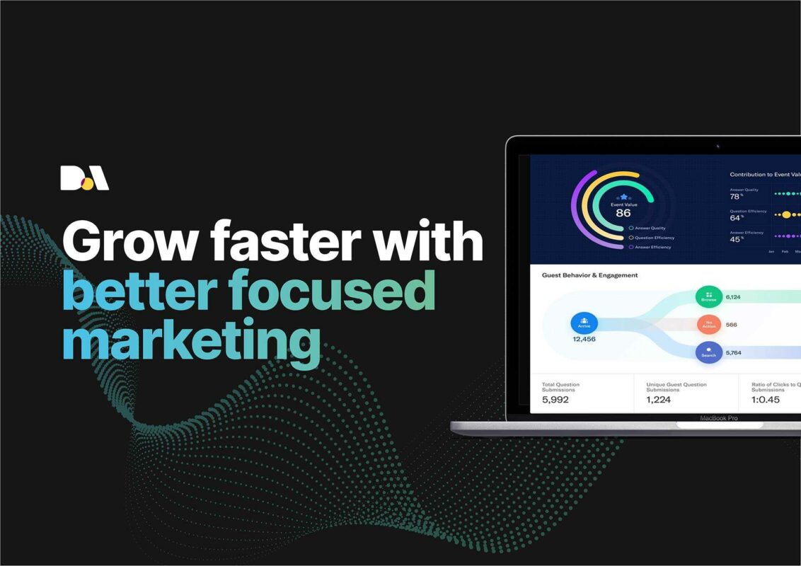
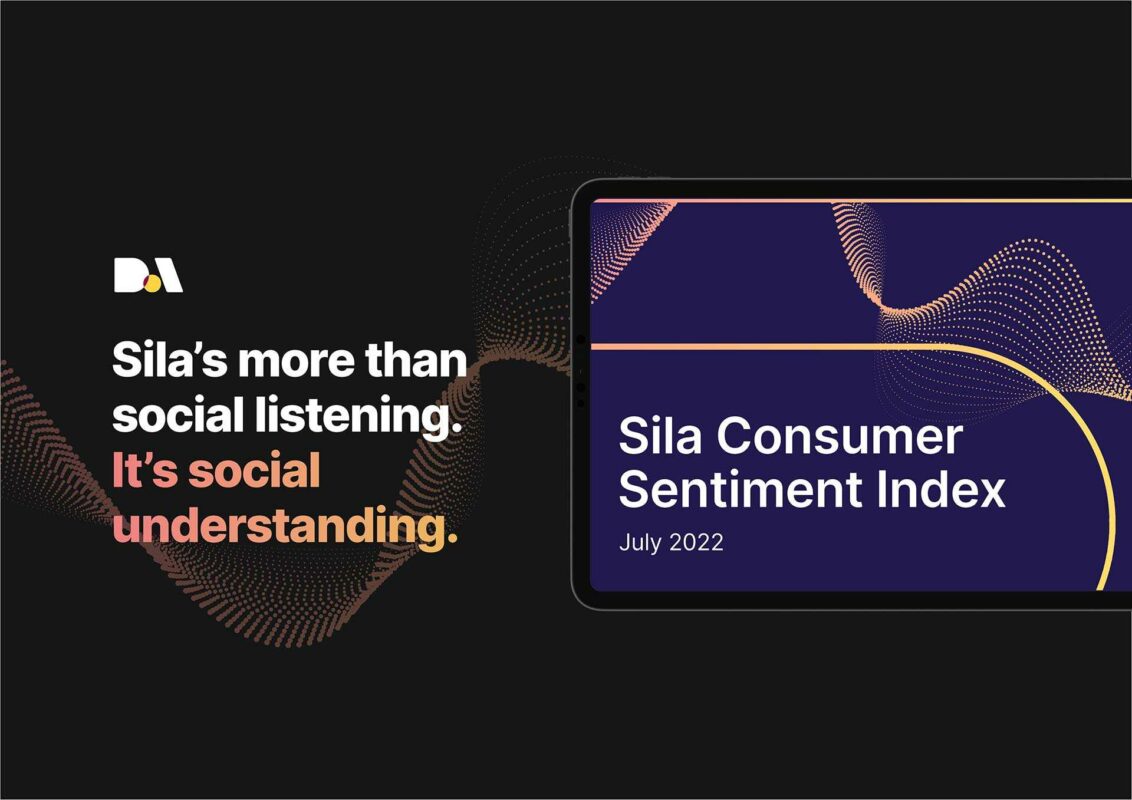
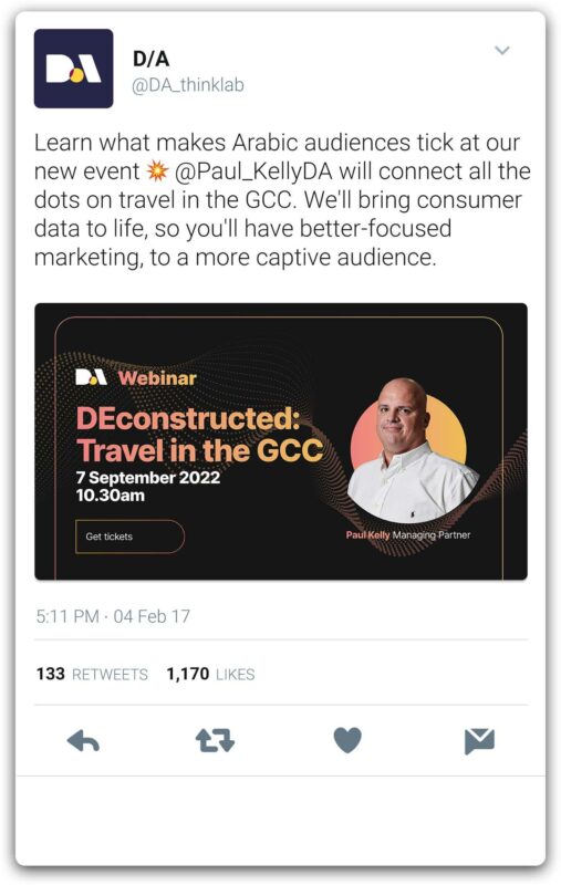
Complementing the simpler language, we stripped back complicated schematic drawings and muted colours to work with bright gradients set off from a dark grey base adding warmth and piquancy.
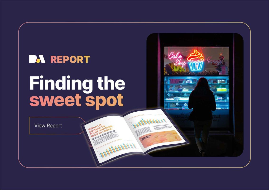
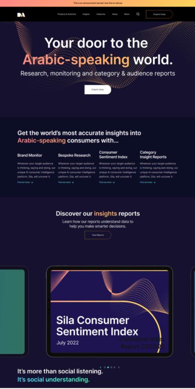
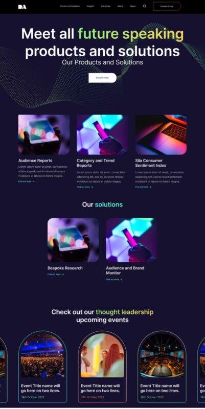
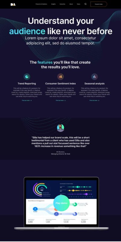
The flexible style guide was applied to a new website, reports, email newsletters and social content, to deliver an impressive, professional and slick suite of brand comms that no competitor comes close to.
The Results
“We worked with ...Gasp! last year to help position, strategise and refresh our brand (including a refreshed website design) and couldn't have been happier with the work. Great approach rooted in holistic marketing principles, great client service, and importantly great creative that understands the brief. Would recommend …Gasp! to anyone.” – Paul Kelly, Managing Director, D/A.
