A NEW TALE, EVERY TIME.
The Brief
Fuller’s had a strong feeling that their collection of pubs with rooms, Bel & The Dragon, had untapped potential. An in-depth research report completed by their research partner White Tiger found that people weren’t getting the full story. Whilst their offer was highly appealing, people either weren’t aware of it or didn’t see a distinct enough reason to visit. One research participant said, “I had no idea it was like that inside, I thought it was just a pub”.
…Gasp! was tasked with creating a sophisticated, distinct and delightful brand narrative that gave a glimpse of what awaits inside Bel & The Dragon and oozed a sense of occasion across all touchpoints.
Each drink, bite or night you spend away from home should be quite unlike the one before it. So that's what you'll get at every one of Bel & The Dragons modern English inns. From special touches at your table to unexpected extras in your room, no two visits are ever the same.

The Response
It all started with some proper diagnosis and research...
The client had already done an extensive and excellent job of understanding how they were perceived. We validated this and enriched it by combing through a set of competitors, taking record and measures of brand codes including logos, slogans, colours, tone, messaging and more. Now we had a baseline. A set of weights and measures for what was expected. It also threw into sharp relief the gaps and opportunities to explore unexpected.
This was not about changing their existing brand codes, but developing and flexing so that we worked in under-utilised territory and claimed some distinction.
Venues: Churt, Kingsclere, Odiham, Reading, Wendover, Westerham
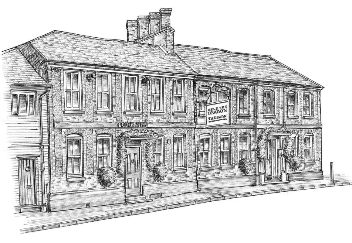
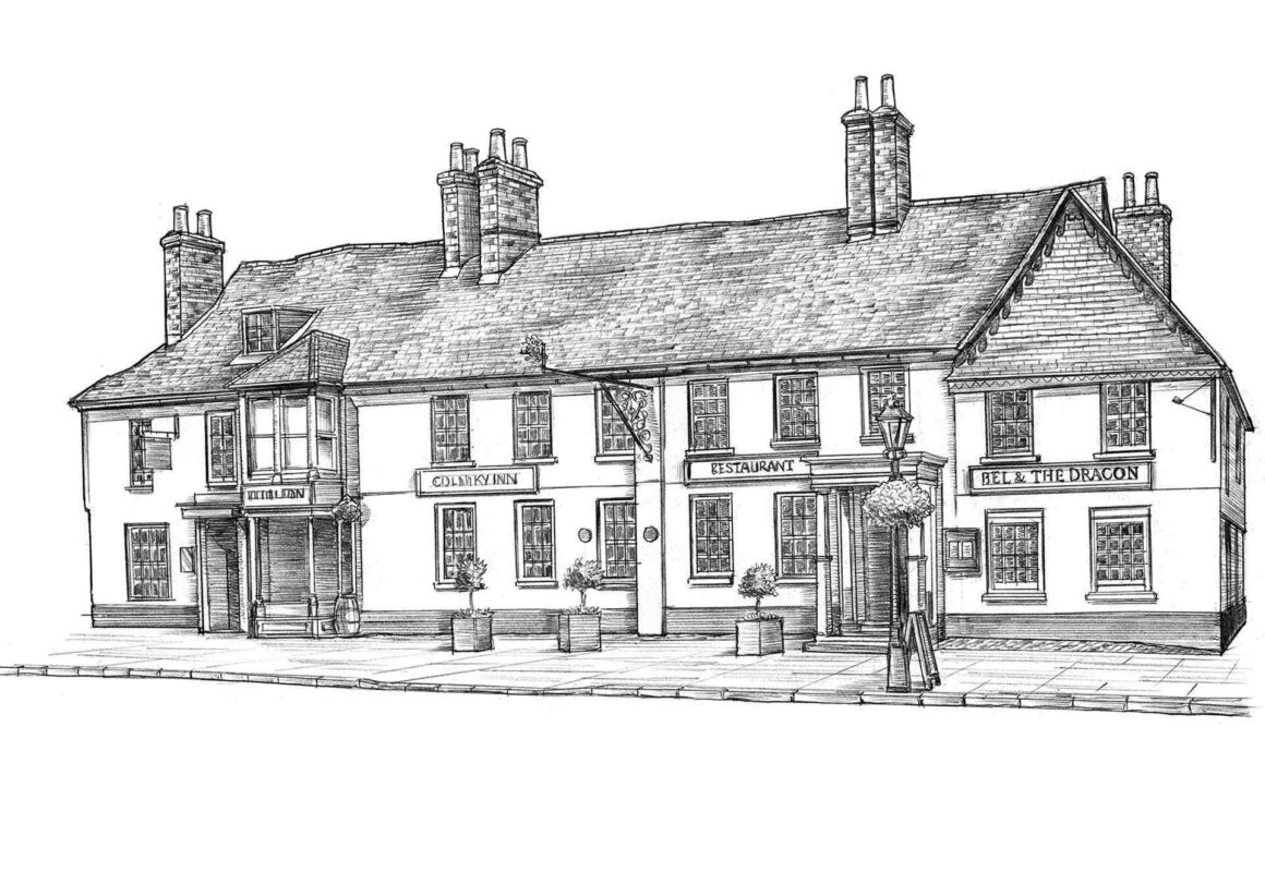
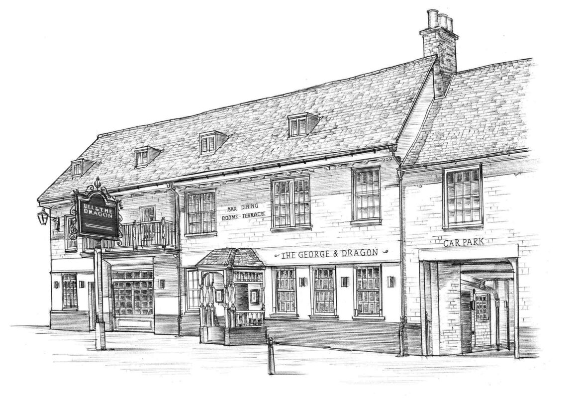
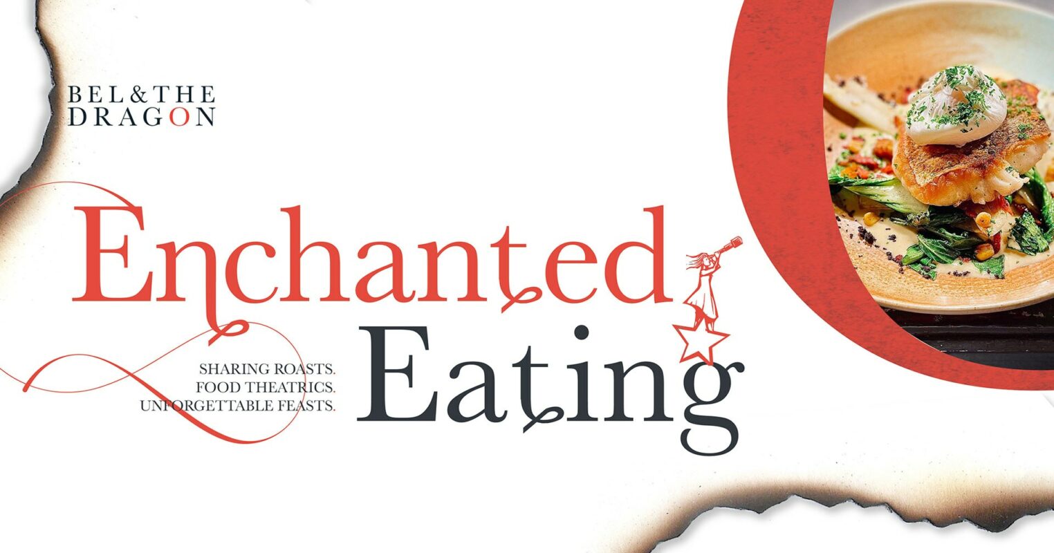
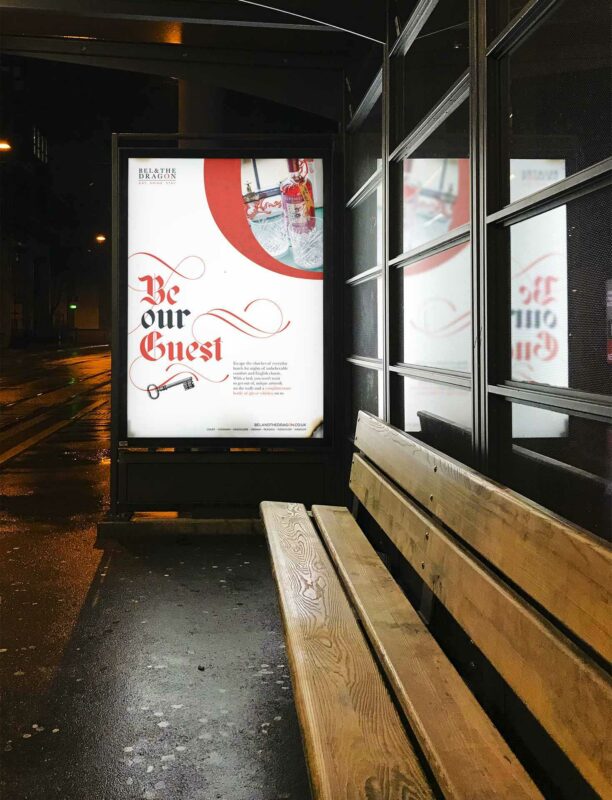
The big idea: Whatever the occasion, a visit to a pub, restaurant, or hotel is infinitely better when they've gone out of their way to make you feel special. You enjoy it more, remember it more, and always leave with a new story to tell. And, with a dragon in our name, we're all about stories.
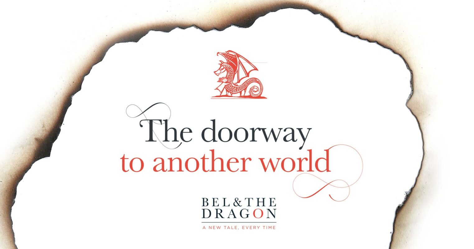
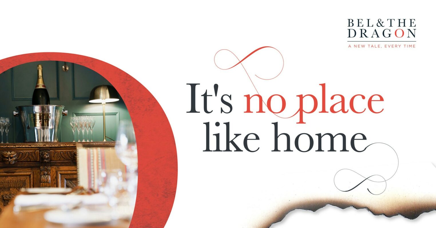
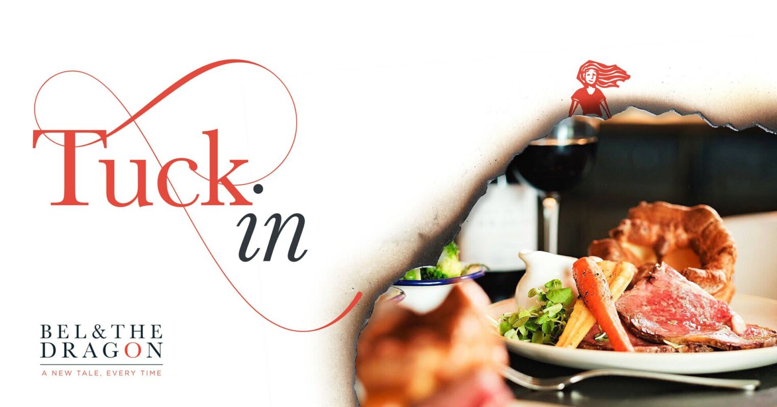
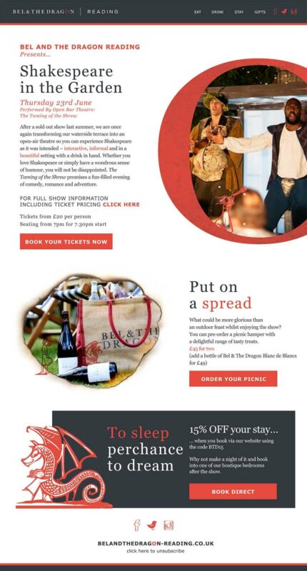
Emotive messaging evocative of storytelling and reminiscent of Old English literature coupled with a bold visual identity, with a minimal palette – taking elements from the established logo as a holding device and introducing a display font that is reminiscent of story books. Small but noticeable attention to detail was applied to menus, signage, emails, web, social content and direct mail to bring our characters to life.
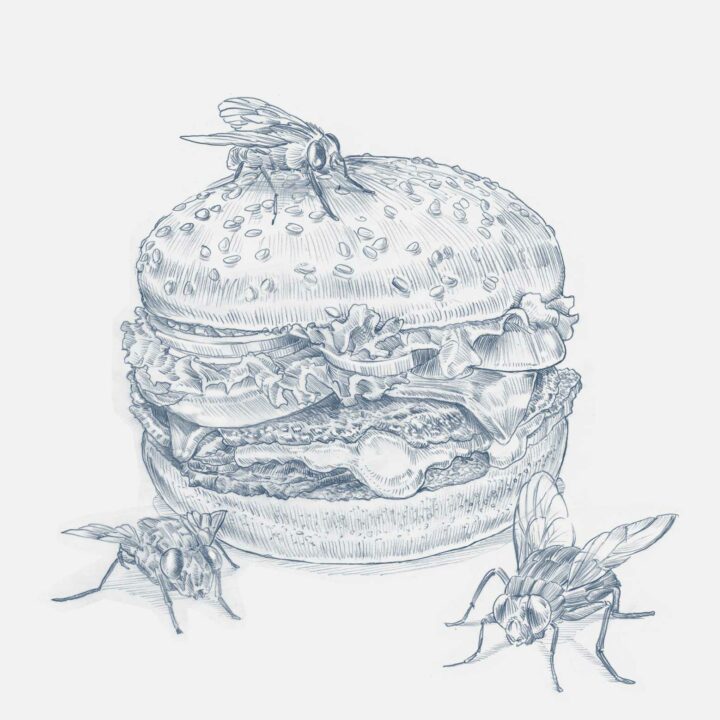
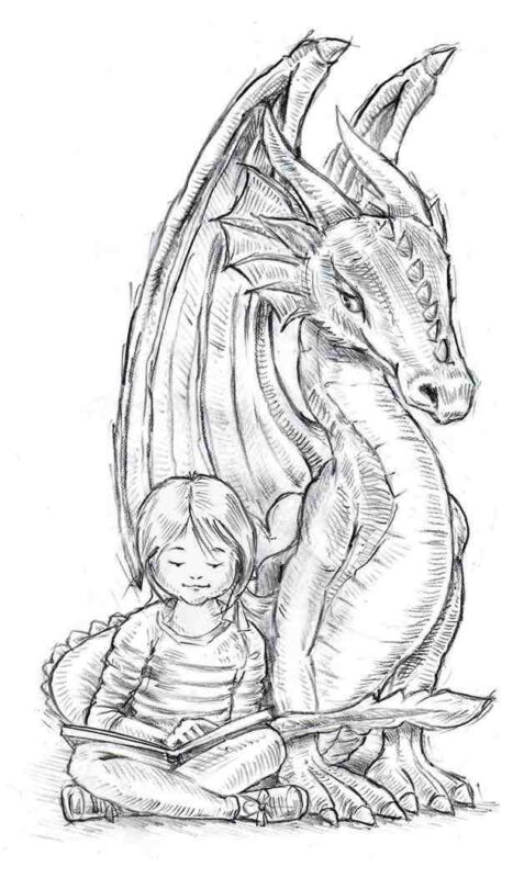
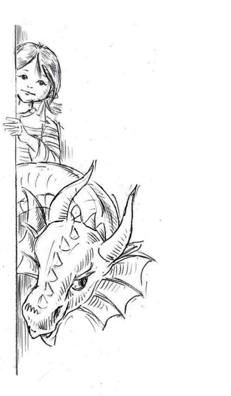
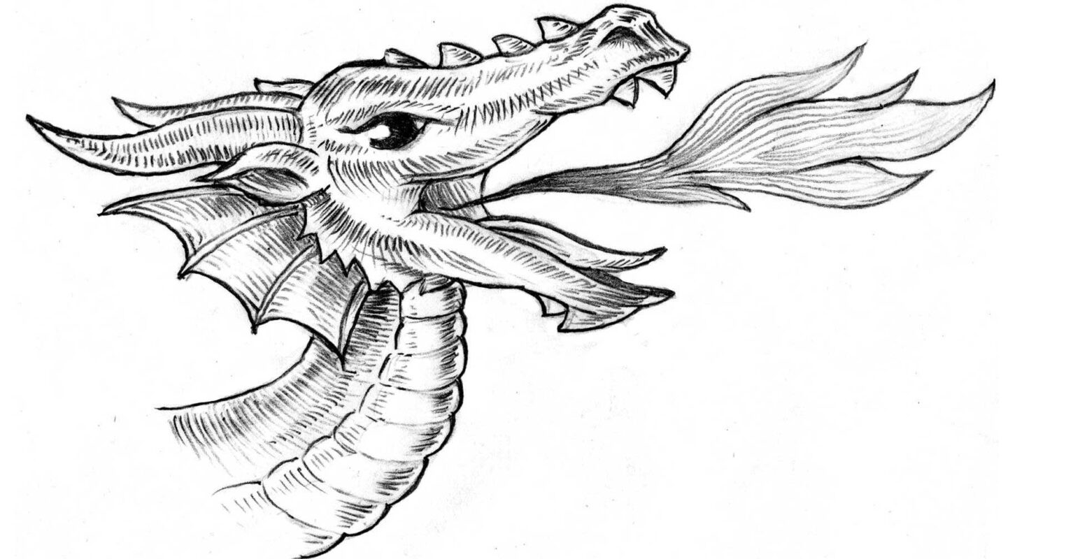
Burn marks, theatrical flourishes of the eye-catching type and the use of the brand's red to add a contemporary note. Full colour photography is overlaid with woodcut illustrations of Bel and The Dragon, interacting with the contents of the image for added personality and a touch of the unexpected.
This style really heroes the copy, making it the centre of focus which was always the intention. To let the character and characters of each Bel & The Dragon come alive around the narrative and tell and new tale every time.
Distinctive, oozing a sense of occasion and above all, memorable.
The Results
We’ll let the guests, the true hero of our story take the lead on what they thought…
“Been by a couple of times in past weeks, (beef wellington was fantastic) and just wanted to drop a quick note to say that I thought the marketing that went out in November was terrific.
The olde-worlde style, charred paper and wax seal was so in keeping with your inn’s namesake… certainly got us through the door!
A nod to the designers, indeed!” - Local Resident
